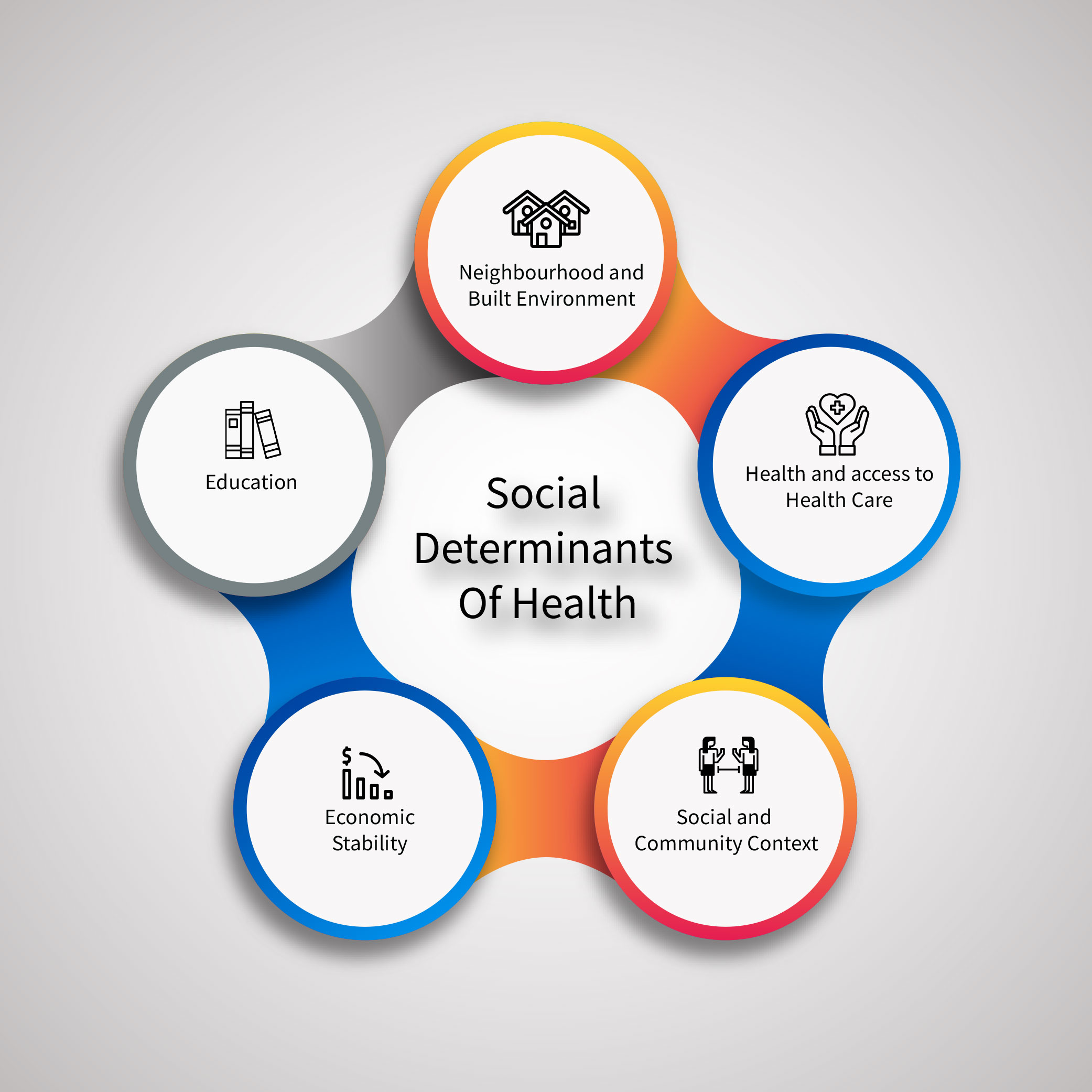
 While social determinants of health—including poverty, physical environment (e.g., smoke exposure, homelessness), and race/ ethnicity—can have a considerable effect on COVID-19 outcomes, their impact on COVID-19 morbidity is perhaps underappreciated. As everyone continues to try to monitor and understand the coronavirus pandemic, visualizing data is a key step in making the pandemic clearer for readers at all levels — researchers, policymakers, and ordinary citizens. Because there is not an area or industry that has been untouched by coronavirus, everyone has thrown their hat into the ring, publishing multiple visualizations of cases over different time points and areas. While useful, these visualizations often overlook the impact of social factors and other underlying health issues that affect how communities deal with coronavirus. Until today, finding statistically valid maps that can display the cases and relevant social determinants of health has been difficult.
Visualizing COVID-19 severity against Chronic Disease burden at the county level
With this problem in mind, an interdisciplinary team at CORMAC launched a locally-focused Maryland dashboard that displays real-time cumulative case and death counts from the Johns Hopkins’ COVID-19 dashboard with the latest 5-year Census estimates to create population-adjusted disease burden counts for Maryland’s counties. The dashboard also incorporates chronic disease estimates from Behavioral Risk Factor Surveillance System (BRFSS) for Maryland at the county level. Guided by research showing that COVID-19 hit people with pre-existing conditions like heart disease and diabetes the hardest, our team wanted to offer a new perspective for the community that we live and work in by visualizing COVID-19 severity against chronic disease burden at the county level.
While population metrics and comorbidities are useful and shed light on specific characteristics that can be attributed to infection and death rates, we also understood that specific occupations may see higher rates of infection. As a result, we created a second version of the dashboard that would incorporate this information from the Census Bureau. The second and latest version of this dashboard offers an expanded view, visualizing data for the entire DMV area and shifting our focus to healthcare resources like available hospital beds and percentage healthcare workers in each county, as well as examining COVID-19 burden by key jobs (e.g. protective services, food workers) and other relevant social determinants (i.e. disease rates for Black, Hispanic, elderly, and uninsured residents) to highlight potential disparities in disease burden and impact on vital industries.
By visualizing case data with publicly available information on the social and health characteristics of the DMV at the county level, our team aims to provide new insights and help illuminate potential disparities and opportunities for intervention. Using Microsoft Power BI, a widely accessible and easy to use platform, we are offering a resource for laypeople and policymakers to ask their own questions and work towards thoughtful solutions. We invite you to test your own hypotheses by interacting with the different charts. Let us know if there is additional data or a different way to look at the data you may be interested in. We will take all feedback into consideration as the dashboards evolve in the future.
Frequently Asked Questions
Why can’t I find a county?
- We only include counties for which we have both COVID-19 case counts and health and Census information.
Why is the health dashboard just Maryland?
- Within the DC metro area, BRFSS data was only available for Maryland.
Why am I seeing extreme outliers in the health dashboards?
- Some counties will have either extremely high or extremely low prevalence rates due to smaller sample sizes.
